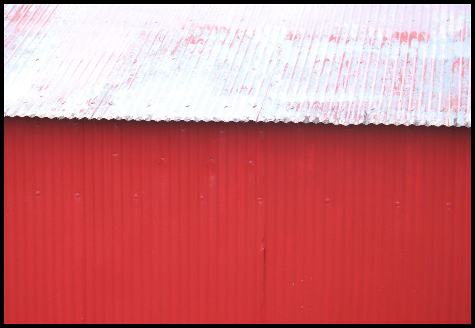
Corrugated Shed
Architecture_02
path=(/images/a/N40/)
pid=(49)
eid=(4) email sent
---------
This is not very interesting to me.
Barbara Wiegand
2006-12-28 22:19:40
---------
Plain picture but powerfull message of curiosity. It gives a viewer to look for more and get interested in the picture!
Osborne Shela
2006-12-28 23:06:44
---------
I like the simplicity and the contrast in colours.
Anne Kotzman
2006-12-28 23:19:06
---------
very nice! i like this better than the next one, not sure why
Vera Komisarjevsky
2006-12-28 23:28:18
---------
Okay, this is different, but also has a nice simplicity about it.
Anne Kotzman
2006-12-28 23:32:37
---------
Not enough contrast between wall and roof
Karen Greif
2006-12-29 06:19:29
---------
If its title hadn't given it away, I would have had a hard time trying to figure out what it was. Which is okay, but somehow this one didn't grab me. I guess I don't like it as well as some of the others because it isn't grounded by anything - there isn't a front or back, beginning or end. And that may just be a perspective peculiar to me.
Sandy Songer
2006-12-29 06:47:00
---------
Nice color but that's about all I can give it.
Betty Samuel
2006-12-29 07:47:23
---------
I like this one. It might be a close second.
Reid Hayhow
2006-12-29 07:49:40
---------
I think the top is too washed out. Is that too honest!
Jeff Echols
2006-12-29 07:53:57
---------
corrugated red doesn't show up well
John Moran
2006-12-29 08:36:34
---------
Kind of cool. It's hard to tell what you're looking at at first glance, which makes it interesting.
Joel Kaines
2006-12-29 10:01:24
---------
don't like it.
Dennis Sovick
2006-12-29 10:13:03
---------
OK - Not enough detail showing.
Dan Baker
2006-12-29 12:18:15
---------
mmmm color is interesting but doubt capture eyes of the judges
Martha Moran
2006-12-29 13:26:20
---------
not enough for architecture or maybe this is so simple it might work........
Anna Echols
2006-12-29 14:53:47
---------
um, well, doesn't move me much.
JSK
Jennifer Kutzik
2006-12-29 15:59:06
---------
Gene, I like this shot, but the light looks a little flat - especially on the red part, such that you can't see the corrugations as much as you might otherwise (though, it might just the monitor I'm currently on). If there was just a little directional light, that would help... though, it's hard to get soft + directional light sometimes. Also, if the red part had more "personality" (i.e. chipped paint, or something), that might help.
-Jonathan
Jonathan Ley
2006-12-29 19:21:30
---------
I wouldn't go for this one, it's interesting but not enogh for a contest
Shachaf Ronen
2006-12-29 21:51:52
---------
Hmmm. Pretty colors and very artistic. It's the kind of picture that could be the catalyst for an arguement at a museum about "What is art -- really?"
MaryLea Dodd
2006-12-30 07:54:05
---------
This image has pleasing colors and obeys the "rule of thirds", but doesn't offer a lot to hold one's interest.
Scott Baily
2006-12-30 12:43:03
---------
This one is a little too much the same. Not alot of interest however it fits the scheme of things. I'm not a real fan of horizontal/vertical lines. The color is good.
Pamela Lee
2006-12-31 13:25:28
---------
This is not very interesting to me."
"2006-12-28 22:20:50
Barbara Wiegand
2006-12-28 22:19:40